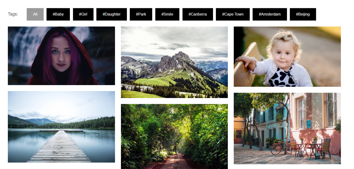
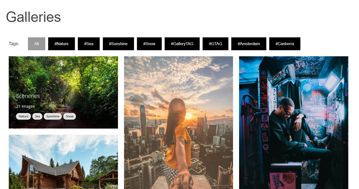
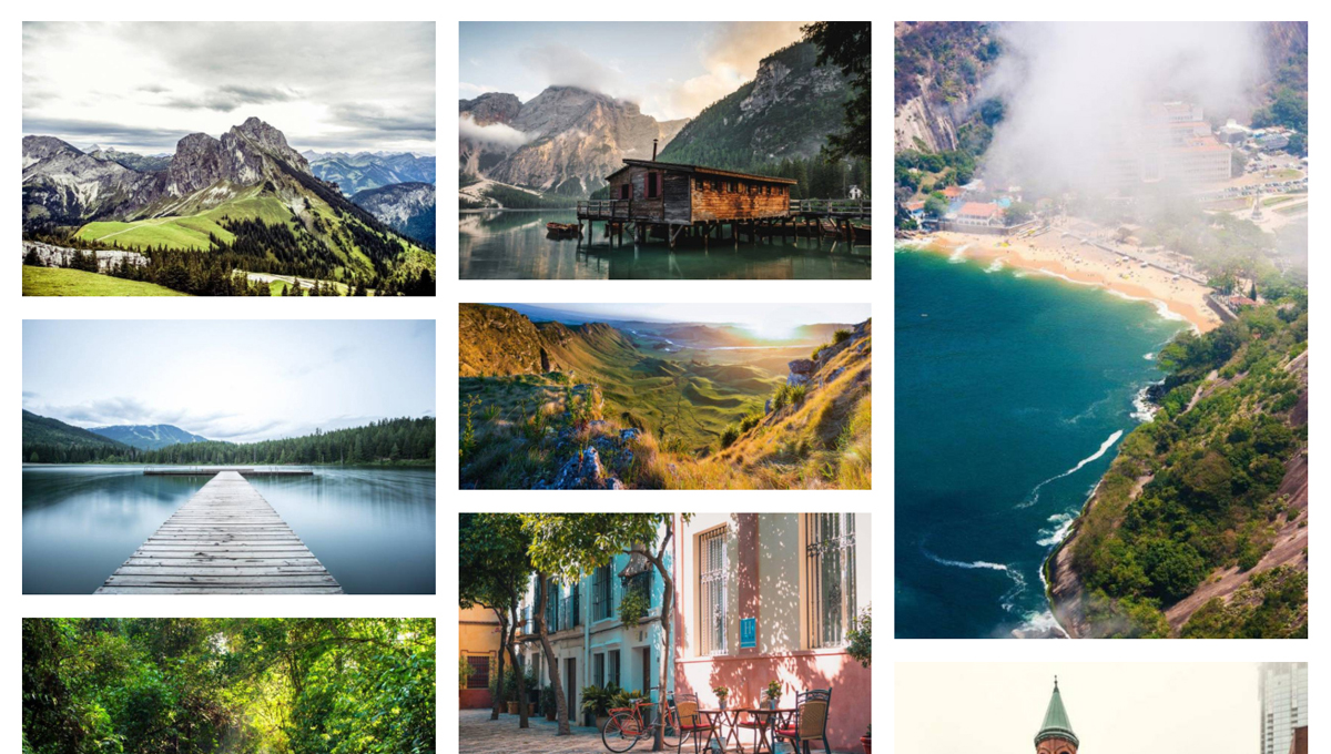
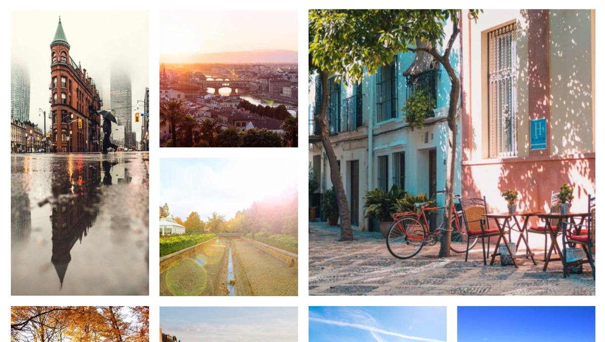
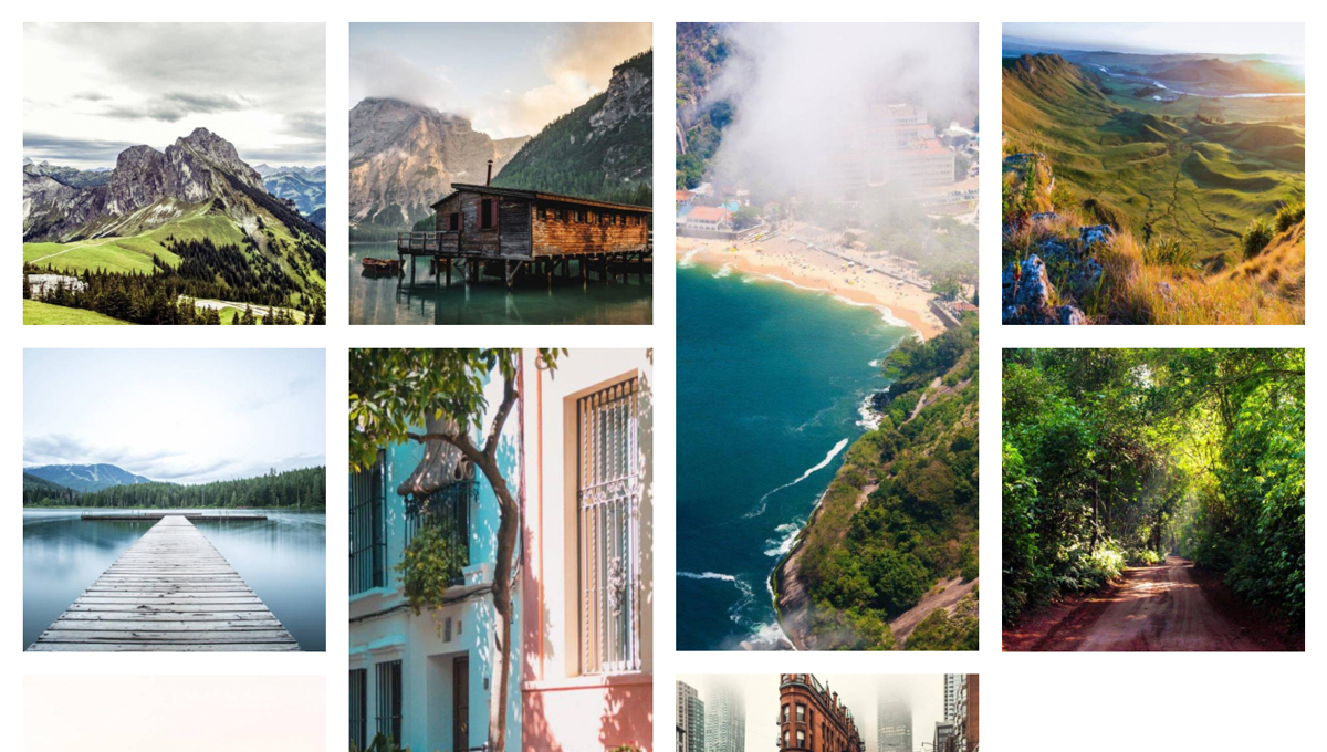
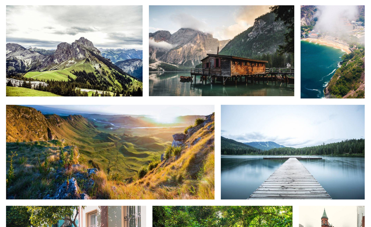
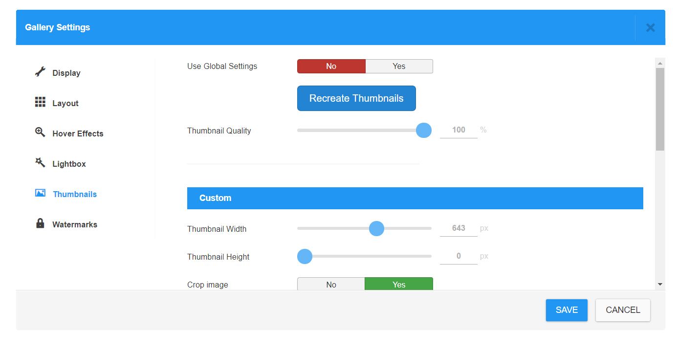
Documentation

Use Categories

How to Use Categories in Gallery

A Gallery can contain unlimited Categories. You can assign selected Images to a Category inside the Gallery. Categories can be used for Filtering Images in Admin panel and also in the Frontent Gallery layouts.

1) Create a Gallery

category0

Set a Category Title 

category1

2) Select Images

category2


3) Move Images into the Category

category3

 4) Open a Category to see filtered images

category4

Use Tags

How to Use Tags

CW Gallery offers a tagging system to organize images and whole galleries for further filtering.

Tags can be added by simple typing and choosing the autocomplete offers of already existing tags. If you want to add a new tag, just use ENTER key to set the tag.

Image Tags

tags 1

Images can be filtered by tags in frontend layout views. For showing the TAGS filter, please enable the filter in Gallery settings

tags 2

You can also decide to show / hide the filter title "Tags:"

tags 3


Gallery Tags

Galleries can be tagged for filtering on frontend view of Galleries menu item.

tags 5

Display Filter by Tags has to be enabled in menu item settings

tags 6

Manage Images

Managing Images

Let's take a look at the Images management.

Upload Images

Upload Images from Desktop

Upload Images from Desktop

Upload Images from Desktop

Add Images from Joomla Folder

Add Images from Joomla Folder

Add Images from Joomla Folder


Sorting Images

Images can be ordered by simple drag and drop method.

Sorting Images


Delete Images

Deleting Single Image can be done via X icon on the Thumbnail Card.

Delete Images

Deleting Multiple images can be done by Selecting Images by clicking on Check icon and then using the Action button Delete Selected Images. Then Confirm the action in Modal Window.

Delete Images


Move Images

Move Images

Select the Category where you want to Move selected Images and Confirm the Action.

Move Images


Layouts

Layouts

Galleries can be displayed in different Layouts. Layout can be set in default Component Options or individually for each Gallery in Gallery Settings. Also Module or Menu Item have their Layout Settings.

Masonry Layout

Masonry is a grid layout based on columns. Custom Thumbnails are used and placed into the vertically aligned collumns filled with defined spaces.Masonry layout is also referred to as the Pinterest Style Layout, as it was the first major website to use this layout style.

layout masonry

Metro Layout

Metro Layout is another variation of Grid Layout. Unlike Masonry Layout, Metro uses strictly defined Grid of  1x1Square, 2x2 Square, 2x1 Portrait and 1:2 Landscape versions of Thumbnails to set the perfect geometry of the Grid Layout.

layout metro

Tile Layout

Tile Layout uses 1x1 Square and 2:1 Portrait Thumbnails to fit the Grid geometry Vertically and Horizontally.

layout tile

Justified Layout

Justified Layout uses Custom Thumbnails to set the Horizontally oriented Grid.

layout justified

Grid3D Card Layout

Grid3D Card Layout uses Square thumbnails to display square grid of cards with 3D hover effect.

layout grid3d card

Grid3D Cube Layout

Grid3D Cube Layout uses Square thumbnails to display square grid of cubes with 3D hover effect.

layout grid3d cube

Hover Effects

Hover Effects

CW Gallery offers a group of different hover effects for image thumbnails. Some of them may be more suitable for bigger thumbnails as they work with borders and overlay mask styling effects. Please choose suitable hover effect that will fit your gallery layout settings together with your needs.

Advanced settings

  • Display Title - show/hide Image Title on Hover
  • Display Description- show/hide Image Description on Hover
  • Display Tags - show/hide Image Tags on Hover
  • Font Size - set a Image Title Font size
  • Import Open Sans - enable to import Open Sans font for caption texts
  • Zoom Thumbnail on Hover - by how many % will the image be Zoomed on hover effect

hovereffect

More settings...

hovereffect

How to show conten under the image

If you want to display image content informations under the image and NOT via Hover effect, do following:

  1. use Masonry Layout
  2. set Visible content to Show

See example:

masonry content

Thumbnails

Thumbnails

Generating Thumbnails

Custom Thumbnail

You can manually define a custom thumbnail width & height. If you disable Crop Image parameter, only width will be set and height will be calculated automatically.
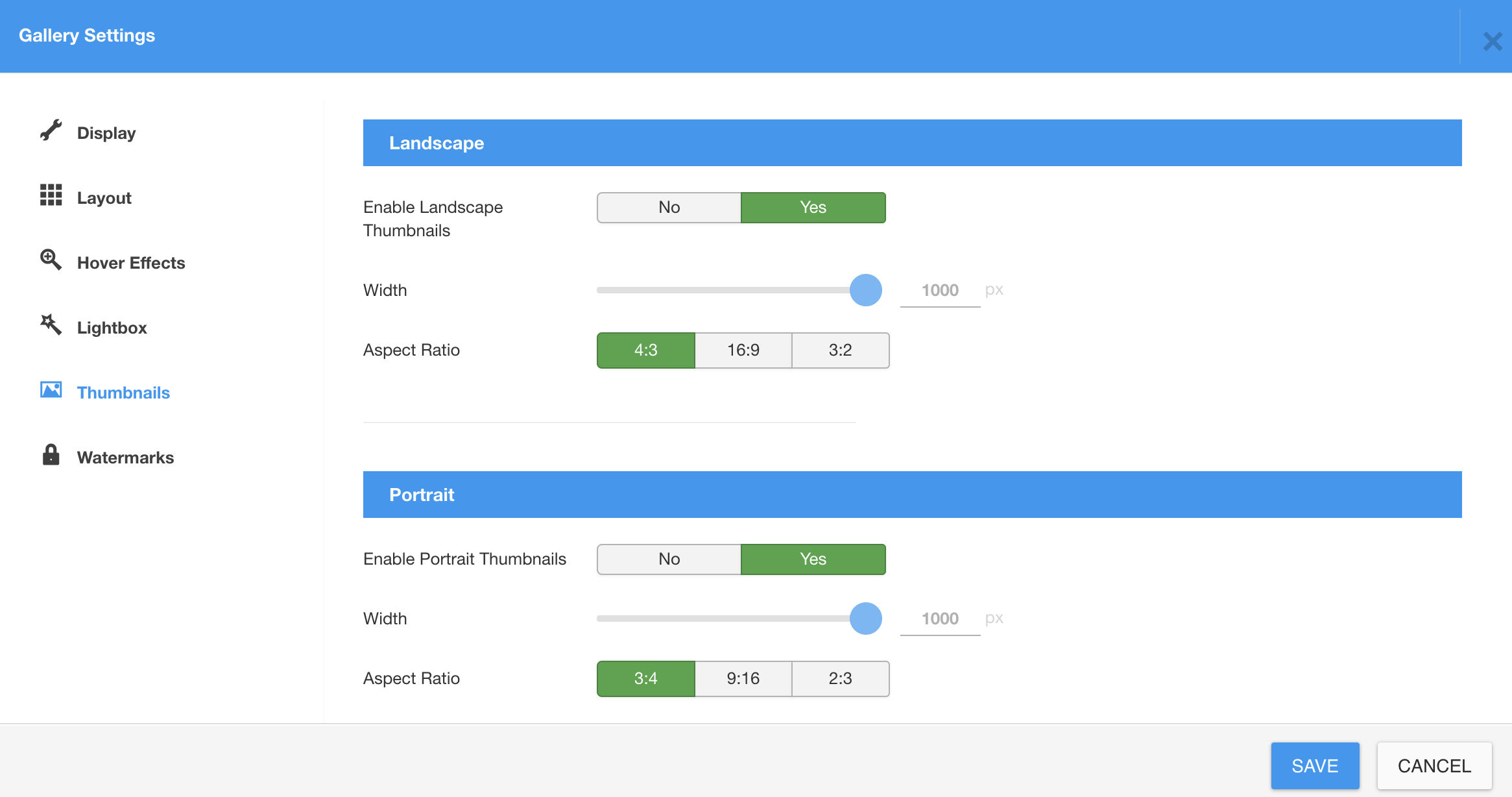
thumbnail

Landscape Thumbnail

CW Gallery is generating a set of thumbnails for each image so it can provide a best suitable thumbnail for gallery output. A Width parameter is being set here along with Ascpet Ratio, so Height will be calculated automatically.

Portrait Thumbnail

For Portrait thumbnail is applied the same as for Landscape thumbnail.

Square Thumbnail

Square thumbnail has only Width settings obviously.

Double Sized Thumbnails

No settings needed for these, they are simply made with double width or height to basic thumbnail.

 thumbnail2 new

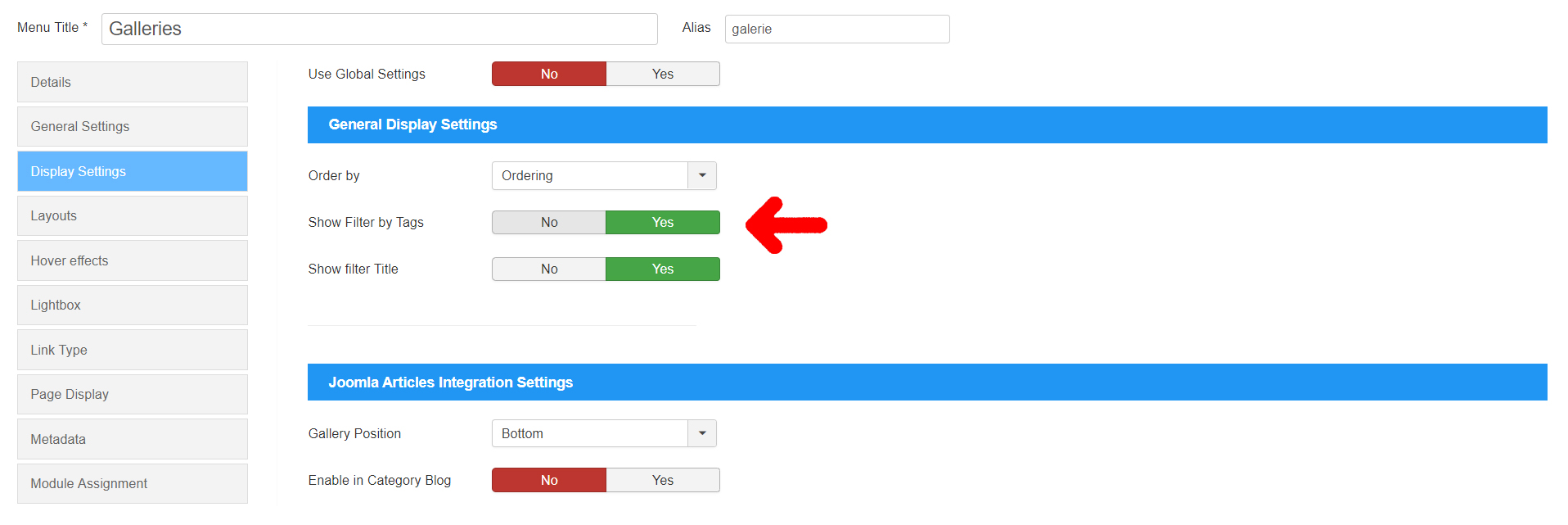
Also please note that these alternative thumbnails can be DISABLED. In that case, gallery will use default thumbnails and fit them in best possible way automatically into the layout grid. It may bring some automatic cropping to fit the layout though. Please consider your requirements for the gallery output and decide yourself what suits you best.

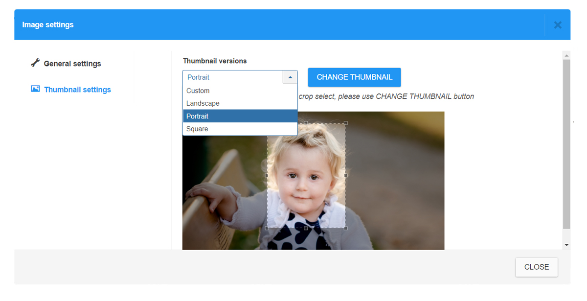
How  to choose a custom Thumbnail Crop

Yes, you really can choose a custom thumbnail Crop for each thumbnail version individually. A Crop area aspect ratio is defined by selected Thumbnail version and Aspect ratio defined for this version in Gallery settings. Position and Size of the Crop area can be customized.

thumbnail3

Also please note that these alternative thumbnail versions can be DISABLED. In that case, special sizes will be calculated automatically to fit the layout the best way possible, using default thumbnails.
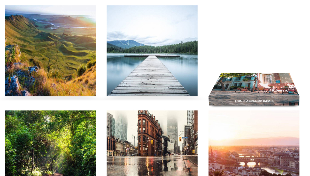
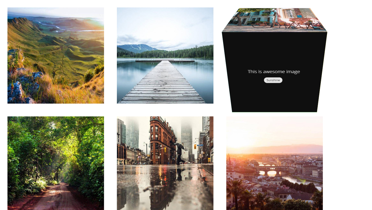
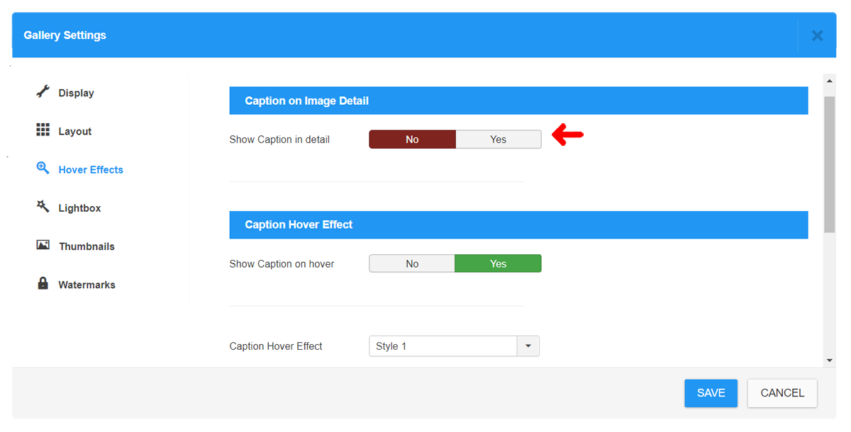
 

Thumbnail Caption

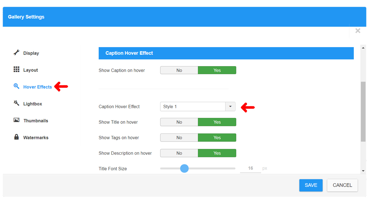
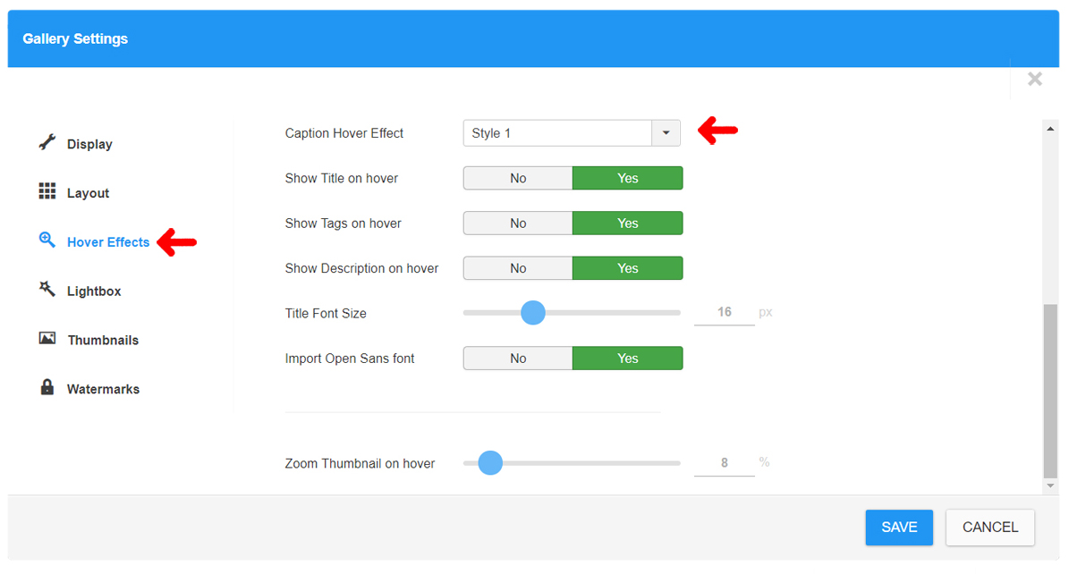
A Caption settings is described in Hover Effects. It can be also fully disabled in Gallery Settings -> Hover Effects -> Show Caption in detail
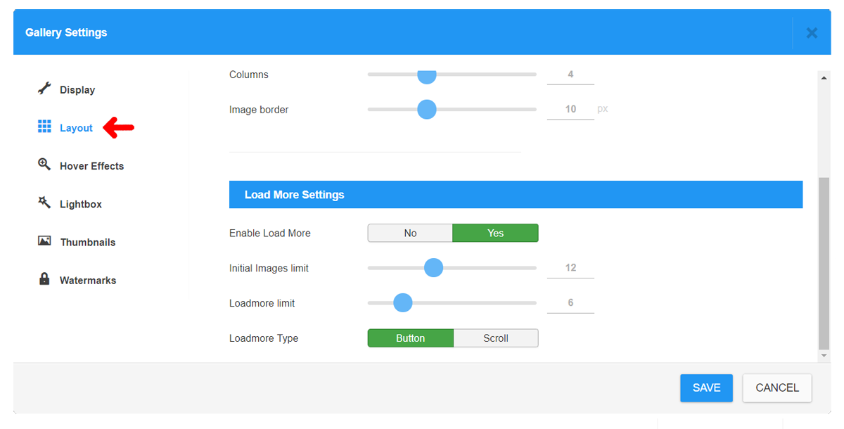
thumbnail4

Thumbnails Spacing

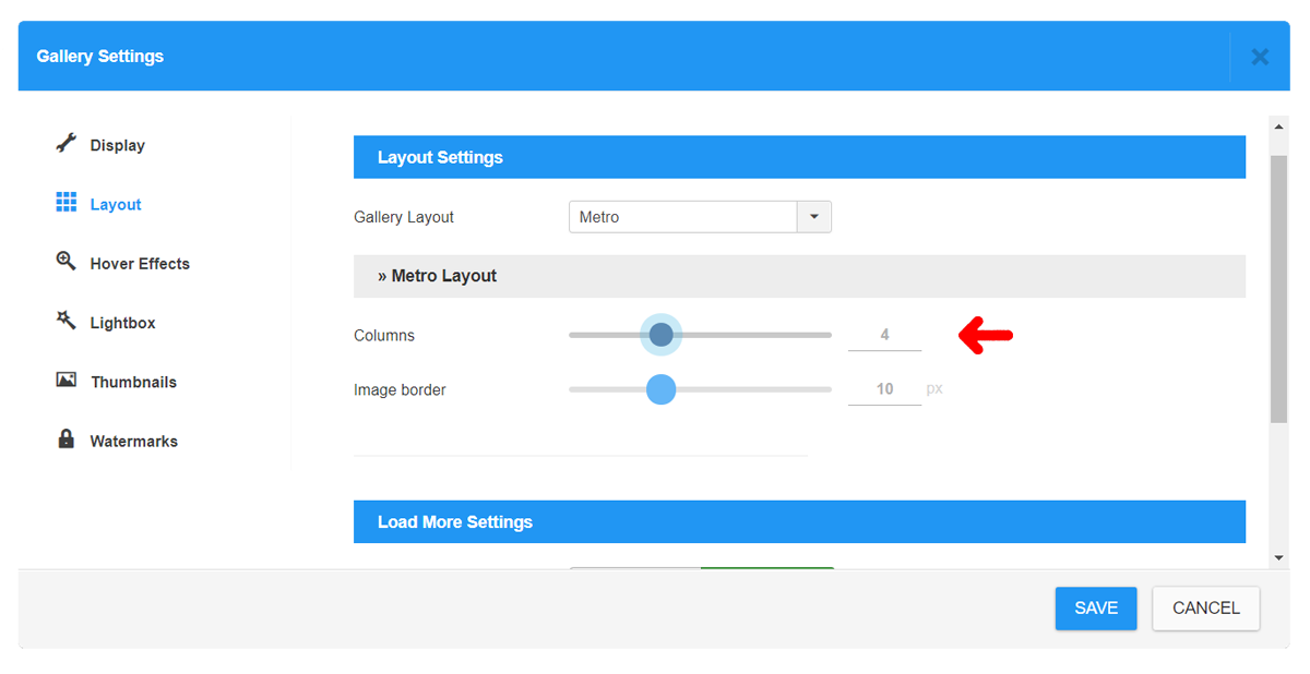
You can manually change the spacing between thumbnails in Gallery Settings -> Layouts -> Image border.
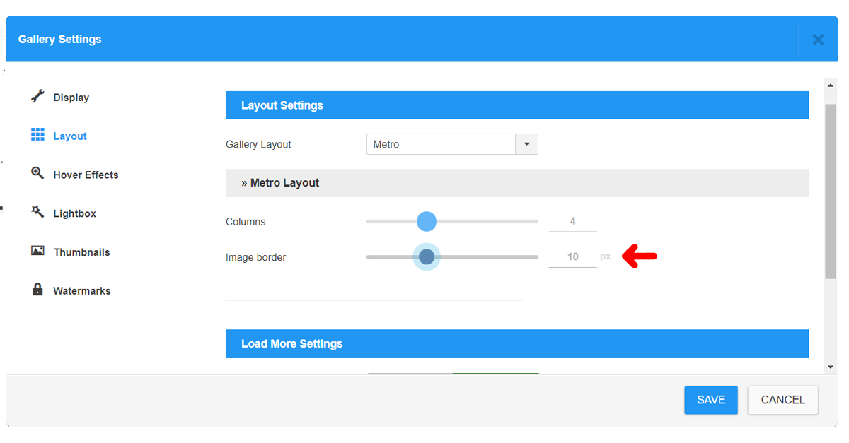
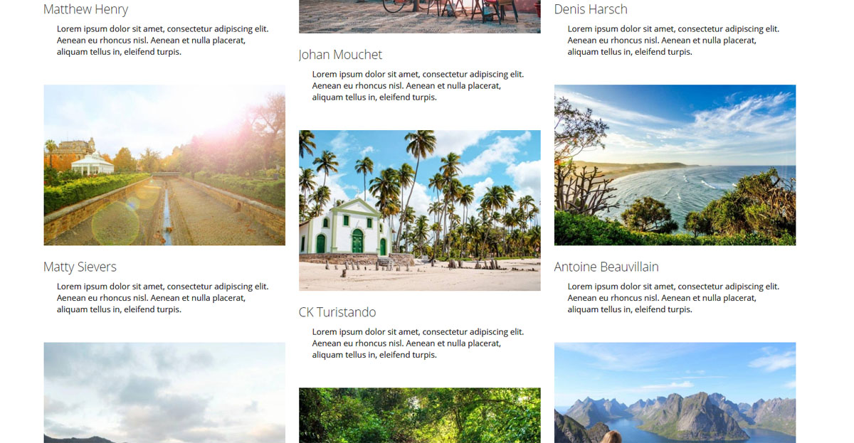
thumbnail5

Number of Columns

You can set a number of Columns for most of Layouts in Gallery Settings -> Layouts -> Columns - with exception of Justified Layout where it is not used. Please keep in mind that for lower number of columns should be set a suitable Thumbnail size so it will not have to be enlarged over its natural size.
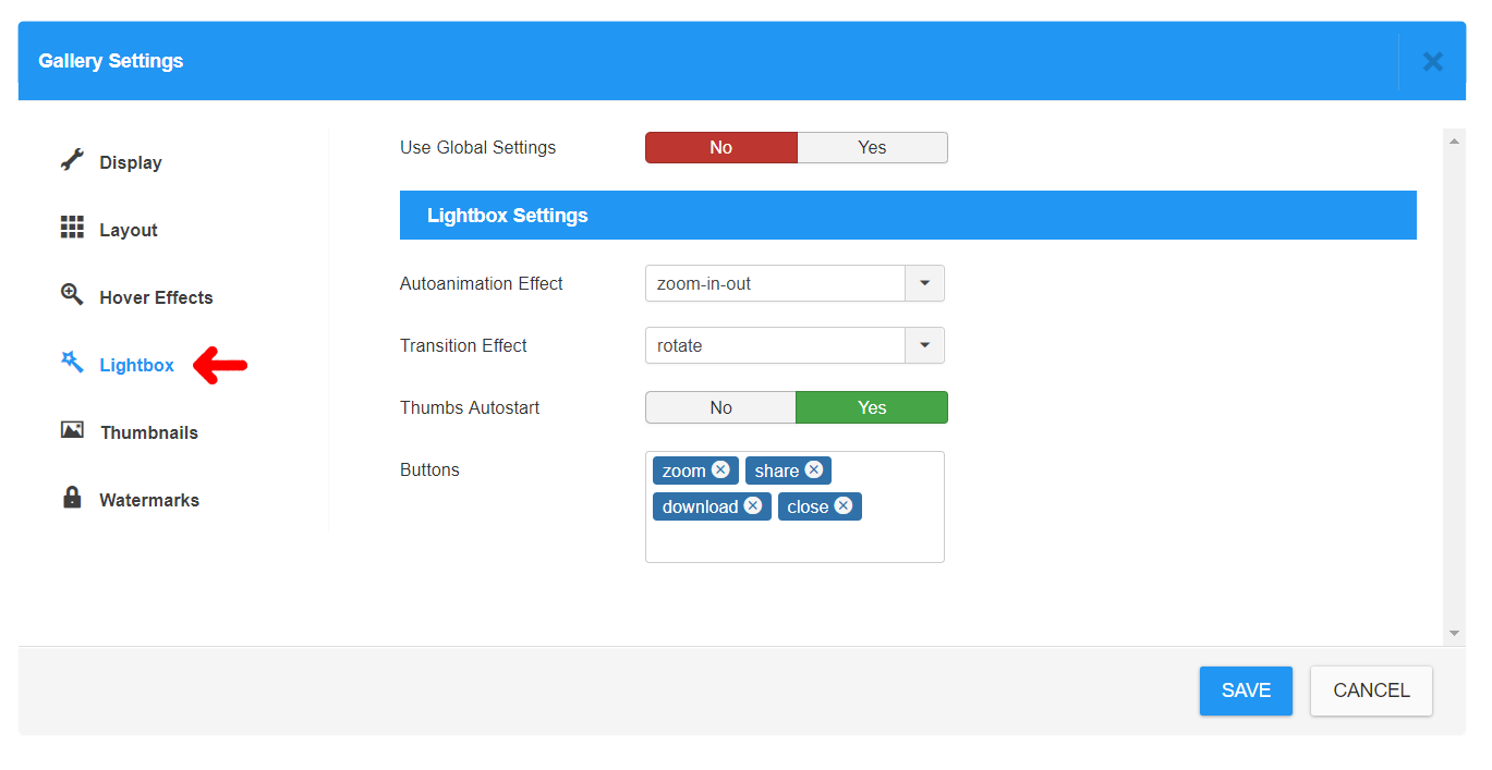
thumbnail6

Lightbox Settings

For Lightbox detail can be set various options:

Autoanimation Effect - effect of open / close of lightbox window

Transition Effect - effect of switching between images

Thumbs Autostart - if thumbnails box should be automatically displayed when lightbox window is opened.

Features Buttons:

  • Zoom
  • Share
  • Slideshow
  • Download
  • Fullscreen
  • Thumbnails
  • Close

thumbnail7

Loadmore Options

Loadmore Options

CW Gallery provides a Load More functionality for improving usability of the gallery output in order to keep usable the whole website with large galleries. If your gallery contain a large amout of images, it is highly recommended to use the Loadmore Option enabled.

Following Options can be set paginating the gallery:

  • Initial Images limit - How many images will be loaded on page load initialy
  • Loadmore limit - How many images will be loaded additionaly on Loadmore trigger
  • Loadmore Type - How is the Loadmore triggered. Either by Button Click or Automatically on Scroll

loadmore

Watermarks

Watermarks

Images can be protected by Watermarks system. Use Gallery Settings -> Watermarks.

Set the Watermark Image - upload your own watermark image, set the Opacity(transparency) and Mode with further detail settings of positioning.

Best results will be achieved with PNG images as Watermark source.

watermarks